
Logos are a fundamental part of branding. The best company logos have more than meets the eye at first glance. There is always a hidden symbol, image or text that subtly speaks more about the company. Even though we are drawn to simple and straightforward logos, marketers captivate our attention by turning them into an expedition of discovery. Below are the best brand logos and their hidden meanings.
IBM

This company’s values are forged inequality and inclusivity through technological advancement. They are passionate about creating a fair society, either in their workforce or through their innovations. That is what has kept this corporation on top of the game, and you will spot that out if you look at their logo keenly. The famous IBM logo consists of white stripes passing through the blue letterforms. The logo looks like equal signs (=) which represents fairness and balance.
US Cyber Command

This is a government agency tasked with maintaining cybersecurity in the department of defense. They conduct regular cyberspace operations to ascertain strengths and vulnerabilities of the US networks against adversaries. They carry out their operations in secrecy, and it would take a keen eye to unravel the deep meaning of their logo. The Cybercom logo consists of two golden rings encircling a planet and an eagle that stands on swords and a key.
Many people would easily miss it, but the golden ring has a hidden code: 9ec4c12949a4f31474f299058ce2b22a. Eureka! That hidden code has been unravelled, and it is simply a cryptograph that represents the MD5 hash of the group’s mission statement.
BMW
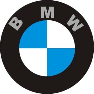
They produce some of the fastest, safest and luxurious cars of the world. The BMW logo has blue and white colours that are mixed in the same fashion as the Bavarian flag, with the letters BMW. According to the company, the logo was inspired by the round design of a rotating aircraft propeller. The white conical spaces are supposed to represent a silver air aircraft propeller blade cutting through a clear blue sky. It is a mere coincidence that the logo’s colours looked like the Bavarian flag, which is their country of origin.
NOW Entertainment
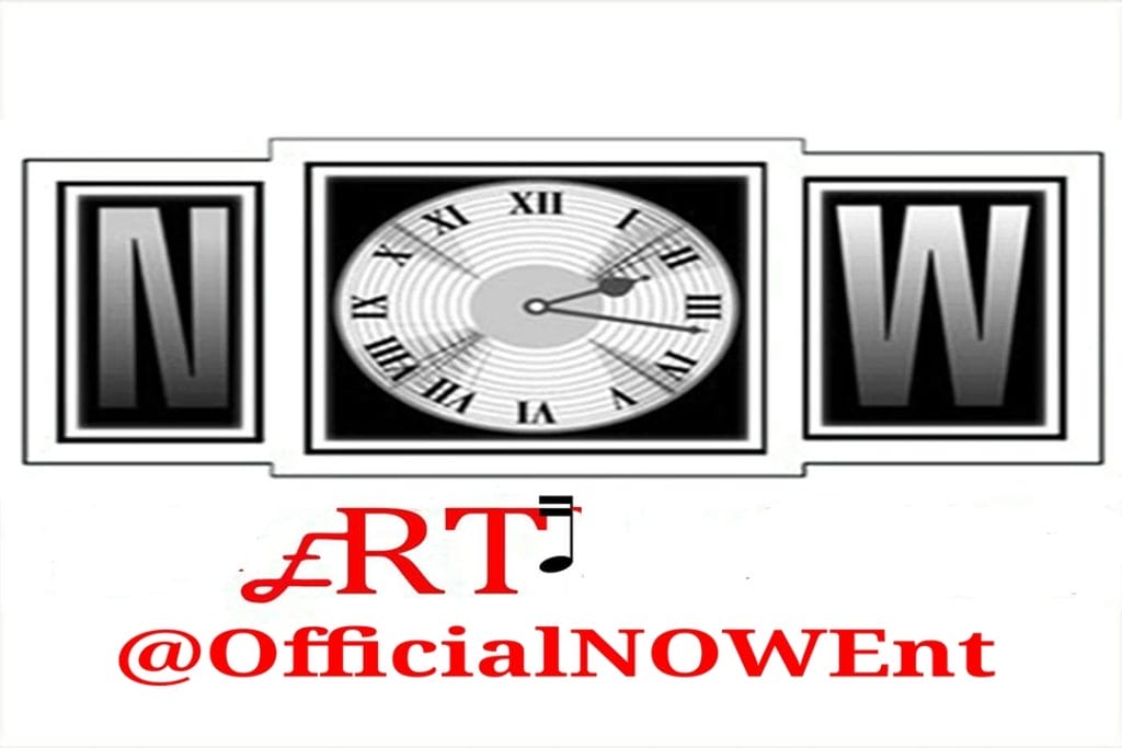
Never Off Work Entertainment is a Gordon, Ga. based Hip Hop record label. The logo has two music notes for two of the letters which let the ART’ hidden in the word Entertainment to stand out clearly. The E in Entertainment is deftly designed to resemble the letter A so that the word sounds like “Ent-Art-Ainment.” That helps the logo to speak about the music business of the company. On social media, the company uses the hashtag #NOWEnt. Then again there is an exciting feature in the letter ‘O’ in NOW. It resembles a clock.
According to the company, time is a valuable a scarce asset, and they encourage artists to make better use of it. The word NOW stands for ‘ the present time.’ The time is now, the past is gone, and no one is sure about the future. As if that’s not enough, NOW means Never off Work. The founders had to struggle with unemployment for a long time, with regular layoffs. They decided to create a company so that they are never off work again.
NIKE
![]()
The logo is rooted deep in mysticism. Nike referred to a Greek goddess of conquest. It doesn’t take ken eye to notice that the swoosh under the NIKE logo resembles a wing. The goddess was the giver of power and enthusiasms in battles, and worriers would call on her in battlegrounds. NIKE flew around battlefields bestowing victory in glory and fame to courageous worriers. The mystical symbolism makes perfect sense; it takes a warrior heart to achieve victory in sports too. Because of the swoosh, NIKE has amassed not only recognition across the world, but also wealth. The NIKE brand is a worth of $26 billion.
Apple
The symbol of the slightly bitten apple is our inseparable companion. But have you ever cared to find out the logic behind that bitten eaten apple? Lucky, for you, I did the digging. I bet you remember Sir Isaac Newton and his discovery of gravity from falling apple. That is the origin of the tech company’s apple. The apple had to be bitten so that people don’t think it’s a cherry. Contrary to popular belief, Apple’s apple has nothing to do with Adam’s Apple from the Tree of Knowledge.
Logos are a powerful tool for marketing. Successful brand logos are not oversimplified. They are laden with meaning for a curious mind and keen eye.


